The Client Portal project included the main application page for most of our B2B clients. As part of our redesign we restructured our applications into a few top-level sections, and analyzed use history to serve up the most relevant applications first, to ensure a streamlined user experience.
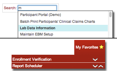 The primary issue from our user testing and surveys was finding the applications they were looking for. With about 180 different applications in our library, it was easy for them to get lost. To combat the issue, and to ease the transition into a new system, we implemented a two-pronged solution:
-
Build a search field into the main page, that allowed users to quickly find the app they were looking for.
-
Create a 'favorites' system similar to bookmarking a website. With a single click, users are able to add an app to a user-built and organized menu, to fit their exact needs.
The redesign also included a number of applications within the system. Again, this took the form of a two-layered approach. The first step was simply to overhaul the data visualization. Prior to our redesign, the user workflow was little more than selecting data points and generating output, usually in a table.
What we created was a new interactive visual layer, representing the results in canvas graphs that allowed the user to click an element and dig further into their data. We also inverted the criteria selection model, instead giving users a global snapshot of their entire population, then filtering via a quick select option or opening the "Filters" panel (above) for more targetted output.